Writing and Printing
Akzidenz-Grotesk
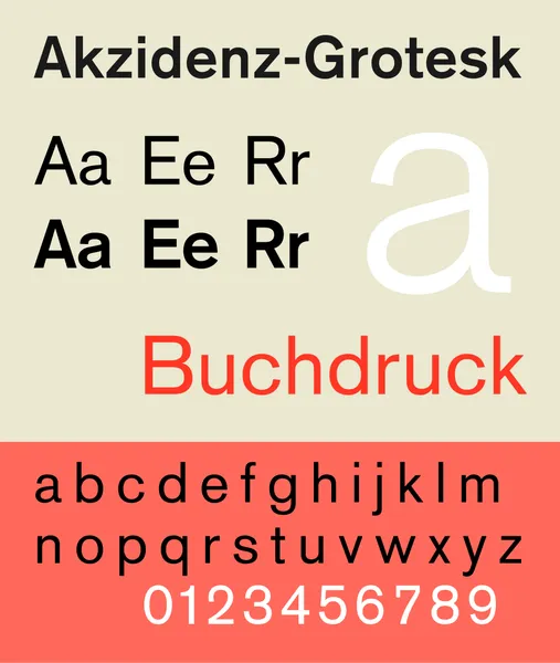
Akzidenz-Grotesk is a sans-serif typeface family originally released by the Berthold Type Foundry of Berlin in 1898. The German Akzidenz (literally 'jobbing' or 'used for jobs') indicates its intended use as a typeface for commercial print runs such as publicity, tickets, and forms—as opposed to fine printing—and Grotesk, akin to grotesque, was a standard name for sans-serif typefaces at the time (grotesque in its original sense; bizarre, odd, or outlandish, not necessarily ugly, but visually jarring and outside the norm at the time). Originating during the late nineteenth century, Akzidenz-Grotesk belongs to a tradition of general-purpose, unadorned sans-serif types that had become dominant in German printing during the nineteenth century. Relatively little-known for a half-century after its introduction, it achieved iconic status in the post-war period as the preferred typeface of many Swiss graphic designers in what became called the "International" or "Swiss" design style which became popular across the Western world in the 1950s and 1960s. Its simple, neutral design has also influenced many later typefaces. It has sometimes been sold as Standard in English-speaking countries, and a variety of digital versions have been released by Berthold and other companies.
Also on this shelf
Arabic script.
History of Tampa, Florida.
See also
Uncatalogued shelfText from Wikipedia; plate via Wikimedia Commons. Text CC BY-SA 4.0; plate freely licensed (see Commons). Source record. Images and catalogue data are reproduced from open-access collections.